Thursday, October 8, 2009

don’t read beauty magazines, they will only make you feel ugly


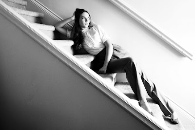
This photo was taken a few days ago and i was so pleased with it i felt obligated to post it and use it for my midterm. This was taken in my house, obviously on my staircase. It was a tricky shot because there is actually no wall at the end of the banister so i had to create it myself using the clone stamp and the paint tool. After i blended, paint brushed and cropped this image, it created the composition you see here. I increased the highlights and contrast in the levels tool to give it a more dramatic feel. The reason i enjoy this photo so much is how the banister on the wall, crease in her pants and molding on the near wall elongates her body. For this photo i had her wear very high waisted slacks to elongate her legs, adding to the pants the blouse gives the picture an early 40’s look with a little bit of edge.


“give me your tried, your poor, your huddled masses”


When my family and i traveled to Mexico this past summer we visited a secluded island named Isla Mujeres. It was a beautiful day to take pictures because the lighting as you can see was fantastic, it was about 4pm so there was really nice horizontal sunlight. I am a stickler on exceptional image quality so that might be why i was so pleased with this shot. The bright light allowed me to use a fast shudder speed immediately eliminating any blur. I shot this originally in color but it didn’t completely please me until i put it in gray-scale. I increased the contrast only slightly because the harsh shadows and bright highlights made by the sunlight gave me a good amount of contrast. Also the difference between the smooth flowing clouds and the crisp detail of the craggy rocks makes a great contrast in texture.


lifesize


This past Christmas i was in the local Nutcracker production. This brought about great photo opportunities, but instead of finding them on the stage i discovered the best ones were behind stage watching the dancers in their natural unknowing beauty. In this picture the ballerina is shown watching her fellow classmates dance with great concentration. Luckily she was standing in front of one of the wings so it created a perfect black backdrop. The bright lights on the stage create great light for a profile shot of her, creating an outline of her neck, back and arm. Also her tutu catches light towards the back so it forces your eyes not only to look at the brightly illuminated section of the photo but her dimly lit back and sparkle of her tiara. The stage makeup and the placement of her hands elegantly on her tutu also make her look like a porcelain doll.


then making a wish, he tossed in the sea


When i entered the church pictured below i was met by a half dozen beggars. The man i was most interested in was the one pictured. His bright white shirt against the dark wooden door created great contrast perfect for a excellent black and white picture. Also the bright shirt and cup draw your eyes direclty to the man and then outward to look at the rest of the photo. But i did have some challenges in this picture. The smaller of the two challenges was cropping it perfectly to get the best photo i could. I finnaly decided to take a little off the top and the left side (There was somebody’s bag laying there, you can see the corner of it. It took too much attention away from the subject). The biggest problem was the glare on the marble floor that you can so obviously see on the left. To fix that mess i didn’t have any other option but to use my paint tool and to carefully darken the spot, then i went in with my burn tool and added some contrast/darkness to the chosen area. It took alot of trial an error, but i think i got it.


chick habit


So when i do most of my thinking for my shoots when I’m taking a shower. I was thinking how the lighting in the bathroom would be pretty good cause of the reflective tiles bouncing the light off each other producing really good fill light. Since my bathroom is really, really small placing my lighting was a really big challenge, there was a wall of umbrellas between the model and i so i had to position myself between them very awkwardly. I wanted to get more of an awkward pose out of this picture, and i decided to let her do her own thing with keeping my goal in her mind. She had a variation of poses that weren’t quite right standing up so i asked her if she would do a few sitting, crouching and leaning in the bathtub. The outcome was great, i opened this in photo shop and turned the saturation noticeably high but not so high that it looks bad. Since this picture is a little quirkier i though it brought out the true personality of this photo.

“does this food make me look fat”


In photo 2 we were assigned to choose either to mimic either Cindy Sherman’s or Nate Larson’s style of photography. I chose to use Cindy Sherman’s approach. Her photos show the different roles women play in society. My initial reaction to this assignment was to do the traditional housewife, doing laundry, cooking, cleaning, i wanted to do something different then what was expected so i chose a specific group of women to show. I chose to women with self image problems. Many women aren’t happy with their body, always too fat, too thin, not tan enough or not wearing enough makeup. I wanted to express how some women feel they need to sneak around to eat. Also how people are judgemental and if women eat too much and are thin are considered bulimic, and if they are thin and didn’t eat as much as everyone else she’s considered anorexic. It’s pretty unfair if you ask me.

turn on me


For starters this isn’t a real person. If you can’t tell from the hole in the ear and the cut off arm, it is a mannequin. A few months ago i became very interested in this subject. I think the biggest reason why i was so interested was because the lack of control it gave me. Because it is a plaster mannequin posing it was not really an option. This stipulation intrigued me. So in reaction to this i manipulated around the object, treating it like a statue that was immobile. I circled the subject and toyed with the lighting until i discovered the composition you see here. A single continuous light was used accompanied by a diffusing umbrella courtesy of my photo teacher. Later i manipulated the contrast and hi-light in CS4. I thought to my self that it was finished…… however after i finish one of my works i set it as my desktop background so i can sort of “proof” it. I finally noticed the missing part of the puzzle. The pictures alone is pretty, with the dramatic lighting and rich contrast, but pretty wont get you into art school. Deciding that the photo wasn’t enough i played with it, eventually noticing the smooth pattern on shadow the the left side of the face. As you can see i duplicated it so i had three pictures unified as one. I believe that this repetition really emphasizes the shape of the head and neck. Therefore in my opinion making the piece more abstract than anything else.